
Photo by Dan Cristian Pădureț on Unsplash
Component Driven Development 101
Getting started with creating reusable components with reactjs


Table of contents
Component and Design Token
Modern User Interface has a lot of complexities, while working on the interface, you need to do two things Check if there is consistency in the design in terms of color, font, and components Break down the UI into components.
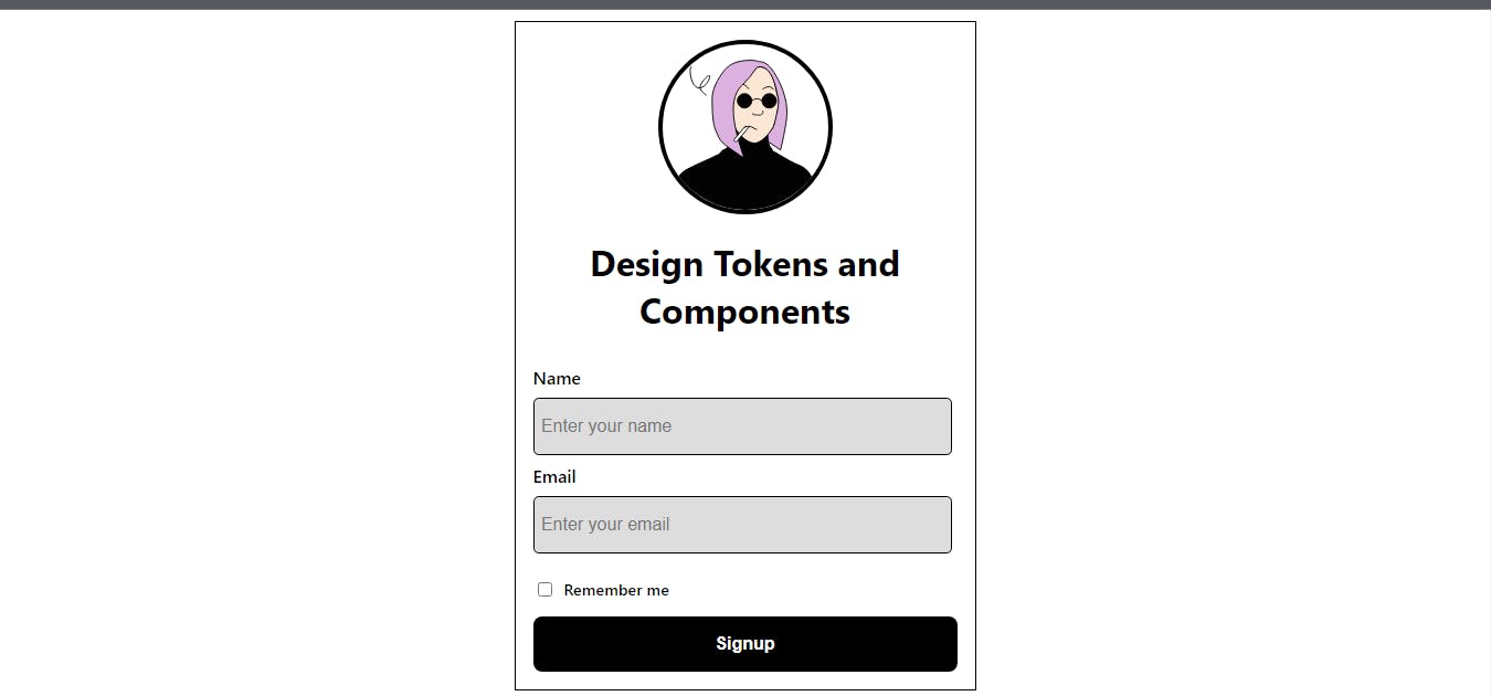
We will create a simple sign-up form with react, at the end of the tutorial you will have something similar to what we have in the image below.
Prerequisite :
To follow along with this article, you need to have:
- Nodejs and Npm are installed on your local machine[ www.nodejs.org]
Installations:
Now we need to create our react application, open your command prompt, and create a folder on your desktop
cd desktop && mkdir component-token
cd component-token
npx create-react-app .
After the successful creation of the project, Now you need to open the folder in your preferred code editor, I will be using vs code, using the commands
code .
At the top of your visual studio code, you will see the terminal, click on it and create a new terminal In the terminal, run the command
npm start
You will see your application running on your browser localhost:3000
Application cleanup
We need to do some cleanup in our application, Now you should have
- public
- node_modules
- Src
- .gitignore
- Package-lock.json
- Package.json
- Readme.md
Open the src folder , and delete app.test.js, reportWebvital.js ,and setup.test.js files
In the app.js file, replace the content of the file with the following
//App.js
import './App.css';


function App() {
  return (
    <div className="App">
    <h1>Design Token and Components</h1>
    </div>
  );
}

export default App;
Also for the index.js file, replace it with the following
import React from 'react';
import ReactDOM from 'react-dom/client';
import './index.css';
import App from './App';


const root = ReactDOM.createRoot(document.getElementById('root'));
root.render(
  <React.StrictMode>
    <App />
  </React.StrictMode>
);
We need to store all our components in a single folder, and create a new folder inside the src called components, In the components folder, you will create 4 files (Avatar.js, Forminput.js, CheckBox.js, Button.js, ), for the avatar, form input, checkbox, and the button, we have in our application.
Avatar.js
In the Avatar.js file, we need an image, I am using JoeMoch random illustration generator.
Paste the following code in the file;
//src/components/Avatar.js

export default function Avatar() {
  return (
      <div className='Avatar'>
          <img
          className='Avatar__image'
              src='https://joeschmoe.io/api/v1/random'
              alt='avatar'

          />
          <style jsx>{`
          .Avatar {

            width: 150px;
            height: 150px;
            border-radius: 50%;
            overflow: hidden;
            border: 4px solid #000;
          }
            .Avatar__image {
                width: 100%;
                height: 100%;
                object-fit: cover;
            }

          }
          `}</style>
    </div>
  )
}
Nothing much here, we just created our image using the JoeMoe API., and gave it a bit of styling,
Forminput.js file For our form input, we need a label and an input, This component takes 3 properties, label, type, and a placeholder.
Paste the following in forminput.js
//src/components/Forminput.js

export default function Forminput({label, type, placeholder}) {
  return (
      <div className='formInput'>
          <label>{label}</label>
          <input
              placeholder={placeholder}
              type={type}
              name={label}
          />
          <style jsx>{`
          .formInput {
            display: flex;
            flex-direction: column;
            align-items: flex-start;
            transition: all 0.3s ease;
            width: 100%;


          }
          .formInput label {
            font-size: 1rem;
            font-weight: 600;
            margin-bottom: 0.5rem;
          }
            .formInput input {
                padding: 1rem 0.4rem;
                font-size: 1rem;
                border: 1px solid #000;
                background-color: #ddd;
                border-radius: 0.3rem;
                width: 95%;

            }
            .formInput input:focus {
                outline: none;
                border: 1px solid #333;
                background-color: #fff;
            }
          `}</style>
    </div>
  )
}
Button.js
This is the button component that we will use in all of our applications, to make it dynamic, we need it to accept a text property. Paste the code in the file
//src/components/Button.js
export default function Button({text}) { return (
      <button className='btn'>
          <span>
              {text}
      </span>

      <style jsx>{`
        .btn {
            background-color: #000;
            color: #fff;
            padding: 1rem 2rem;
            width: 100%;
            border: none;
            border-radius: 0.5rem;
            font-size: 1rem;
            font-weight: 600;
            cursor: pointer;
        }
        .btn:hover {
            background-color: #333;
            transition: all 0.3s ease;

        }
        .btn span {
            display: flex;
            align-items: center;
            gap: 1rem;
            justify-content: center;
        }
        `}</style>
      </button>
) }
CheckBox.js We can also make this dynamic, but for this current project, we will hard code the text,
Paste the following code into the file
//src/components/CheckBox.js

export default function CheckBox() {
  return (
      <div className='checkbox'>

          <input
              type='checkbox'
              name='checkbox'
          />
           <p>Remember me</p>

          <style jsx>{`
          .checkbox {
            display: flex;
            align-items: center;
            align-content: center;
            gap: .5rem;
            transition: all 0.3s ease;
            width: 100%;
          }
            .checkbox p {
                font-size: 0.9rem;
                font-weight: 600;
            }
            .checkbox input {
                font-size: 1rem;
                border: 1px solid #000;
                background-color: #ddd;
                border-radius: 0.3rem;
                cursor: pointer;
            }
            `}</style>
    </div>
  )
}
constants.js file In the src folder, create a constant.js file, where all our constant values will be stored and exported for our component to use.
In the constants.js, paste the following code
// src/constant.js

const FORM_INPUT = [{
    label: 'Name',
    type: 'text',
    name: 'name',
    placeholder: 'Enter your name'
  }, {
    label: 'Email',
    type: 'email',
    name: 'email',
    placeholder: 'Enter your email'
  }
]


export { FORM_INPUT }
*Side Note: Make sure you save each of the files with Ctrl+S*
Now we have created all our components, we need to import each of the components into our main app.js file. The App.js file should look like this after importing all the required components and constants.
import './App.css';
import Forminput from './components/Forminput';
import Avatar from './components/Avatar';
import Button from './components/Button';
import {FORM_INPUT} from './constants'
import CheckBox from './components/checkBox';


function App() {
  return (
    <div className="App">
      <form className='Form-Container'>
        <Avatar />
        <h1>Design Tokens and Components</h1>
        <div className='input-container'>
          {FORM_INPUT.map((input, index) => (
            <Forminput key={index} {...input} />
          ))}
        </div>
        <CheckBox />
      <Button text={"Signup"}/>

      </form>
    </div>
  );
}

export default App;
In the src/App.css file, we need to update the styles with the following,
.App {
  text-align: center;
  margin: auto;
  display: flex;
  flex-direction: column;
}

/* Language: css */
.Form-Container{
  display: flex;
  flex-direction: column;
  align-items: center;
  justify-content: center;
  place-self: center;
  padding: 1rem;
  width: 24rem;
  border: 1px solid #000;
  margin: 3rem 0;
}
.input-container{
  width: 100%;
  display: flex;
  flex-direction: column;
  gap: .5rem;
  padding: 0.5rem;
  border-radius: 0.25rem;
}
Now if you check the localhost:3000, your application should look like this, the avatar may not be the same as we are generating random avatars from an external source.
We can take this a step further, by managing the components using storybook or bit.